CITIA
CMS Platform Redesign
Thrown into the deep end and learning to swim.
My Role
Lead Experience Designer
Task
Interview users, Research, Present, Sitemap, Wireframe, UI, UX, Visual Design
Responsibilities
- Research multiple competitor platforms
- Analyze research and showcased feature patterns
- Interview users
- Filter and analyse feedback
- Present findings to VP of Product, CFO, and CEO
- Create wireframes based on user workflows
- Develop an design system for a unified experience
- Design final screens for the platform interface
- Create spec sheets for developers
- Create tickets in JIRA for development
- Lead Junior Front End-Devs during development
Overview
Citia is a card-based content management system for content strategist to quickly
create pieced of content (cards), bundle that content into a microsite, publish
and distribute into their social streams. As the Lead Experience Designer at Citia,
I believe that the true value of our system is that it is fast and easy to build cards
(piece of content), quickly collect them into a cardsite (microsite), publish instantly, and
immediately share them on their company social media streams.
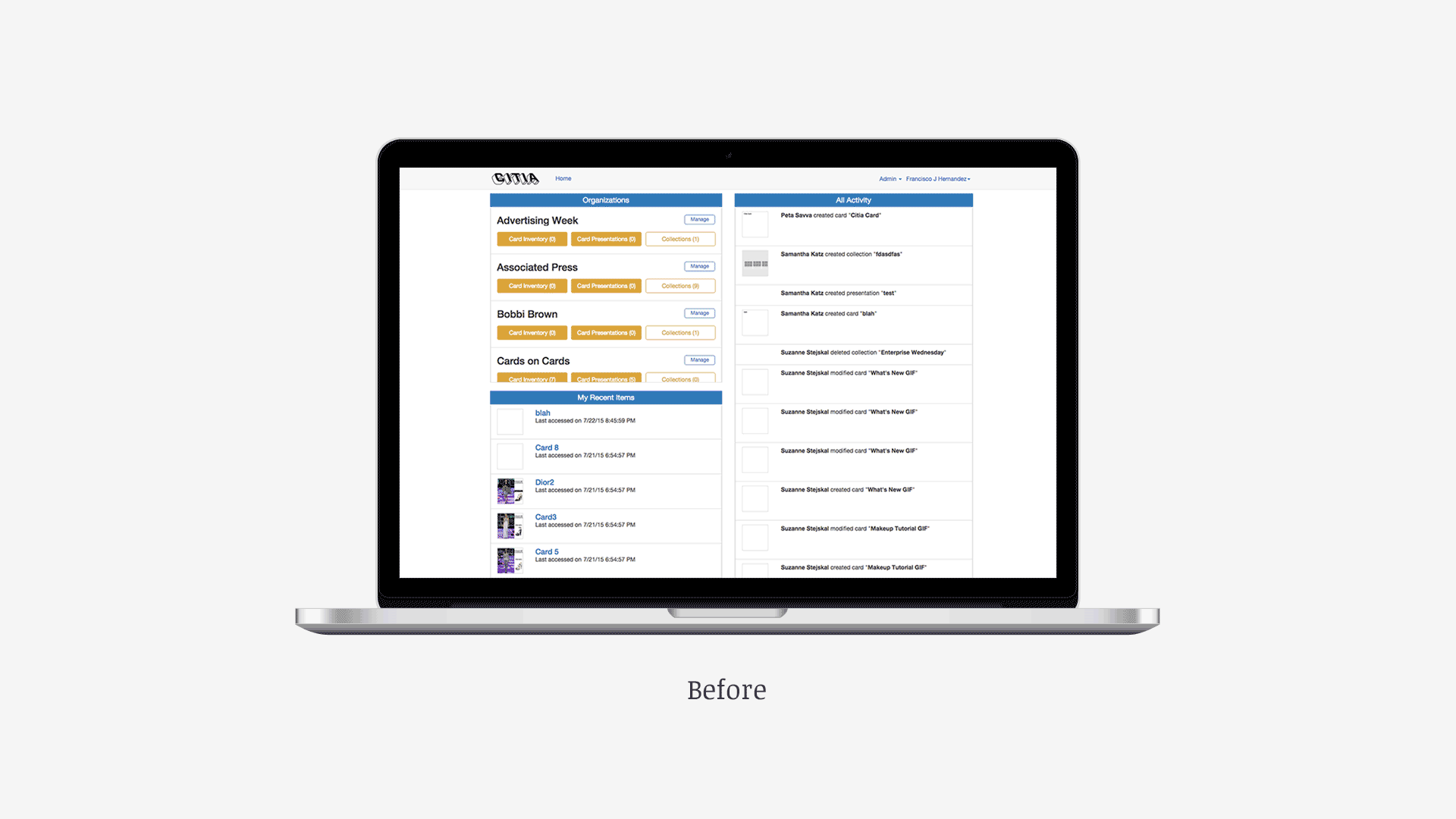
Problem
When I arrived at Citia I received feedback from users that they felt the
navigation experience was disjointed. We had three types of users each with
different tasks. A Content/Social Media Managers who are admistrators of the
account. The manager's main task is to manage people in our software and review
published microsite metrics. Marketers and Content Strategist working closely
with designers to build their campaigns into microsites. The marketer's task
is to publish and launch sites into their company's social media stream. And
finally In-house designers, developers, or interns building cards. Their tasks
is to create and edit content and build sites.
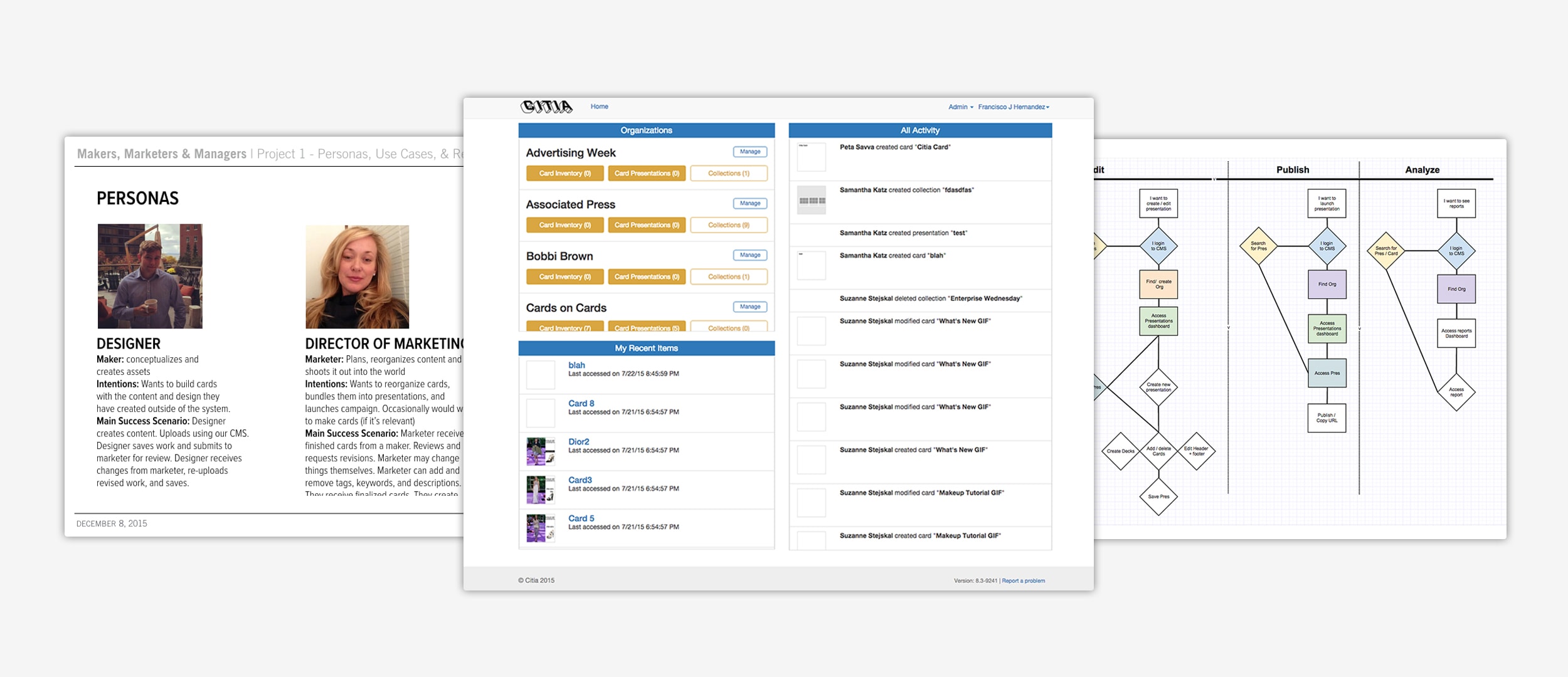
Images (L to R): Personas, Original Screens, User Task Flow
Process
I saw this as an opportunity not only to create an effective navigation
experience for our users but also implement style guide to set rules and
design standards for current and future improvements. I first set out to find
our users pain points and since they were working on the platforms first
iteration they had plenty of feedback. The VP of Product and I discovered
that our essential building pages were buried in our system, our editor tools
were disconnected and did not match our user behaviors, and we were missing
highly needed features such as global search. I presented our findings and
together with the VP of Product and Director of Engineering developed a strategy,
scope of work, and roadmap for delivery. The final proposed deliverals were a dashboard page,
card inventory page, microsite list page, reports page, user profile page, and organization page.
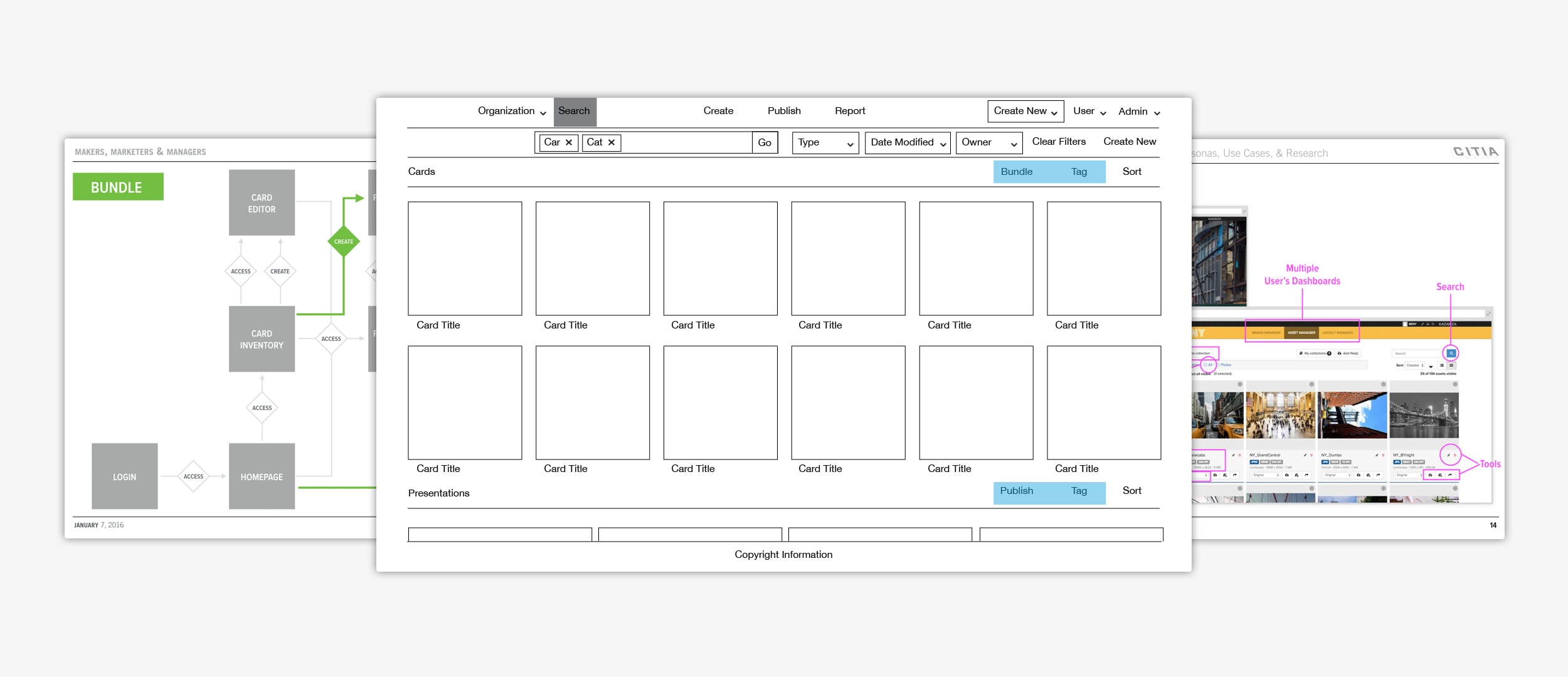
Images (L to R): User Flow, Wireframe, CMS Research
Outcome
I created a more flexible work flow for our users as well as a visually
delightful experience that fit along the suit of products they already use.
Our Client Success team received an influx of client feedback, the likes of GE,
Viacom, and MasterCard, stating how much easier and intuitive our platform had
become. Personally, I was able to find my balance as a Lead Experience Designer
by setting forth my innate skills as a self-started and a team leader and guided
the development team through the expected delivery of our new experience.
I was thrown into the deep end with this project but the adrenaline of being lead
and being responsible for such a big undertaking helped me swim to the top.