CITIA
Cardsite Builder
As part of the process of implementing our new style guide, I used this
opportunity to do surveys our internal users and their clients feedback.
I wanted to make minor improvements without a complete redesign for faster
delivery.
Problem
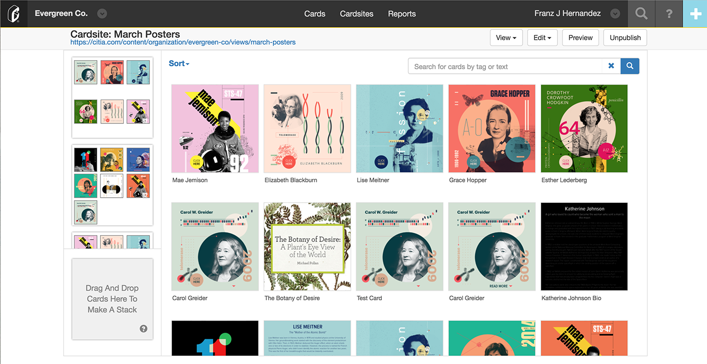
I believe that out of our entire system, our Cardsite Builder is the most innovative tool.
However, the first iteration was not an intuitive tool. I tasked our client support team
to collect our client's feedback and biggest pain points using our builder. I collected all the
feedback and reviewed, investigated, prioritized and then I separated them into improvements and bug fixes.
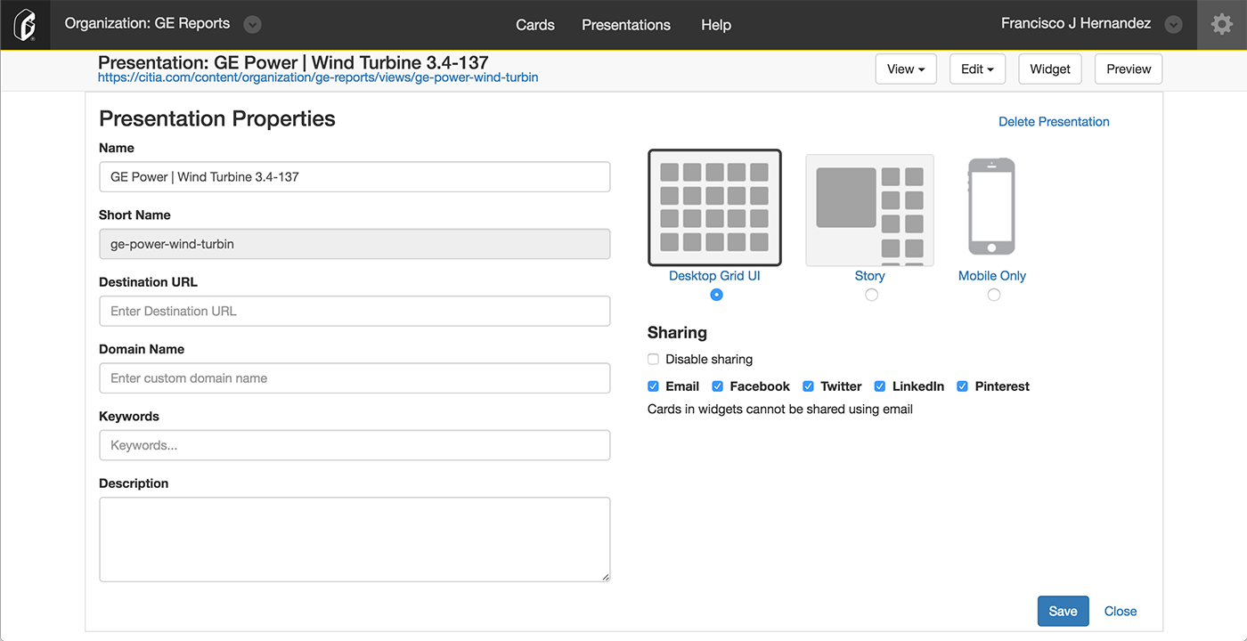
I took these request to the development team and worked with them to create a strategy for
delivering our improved Cardsite Builder. We decided to make feature improvements and bug fixes in the first phase.
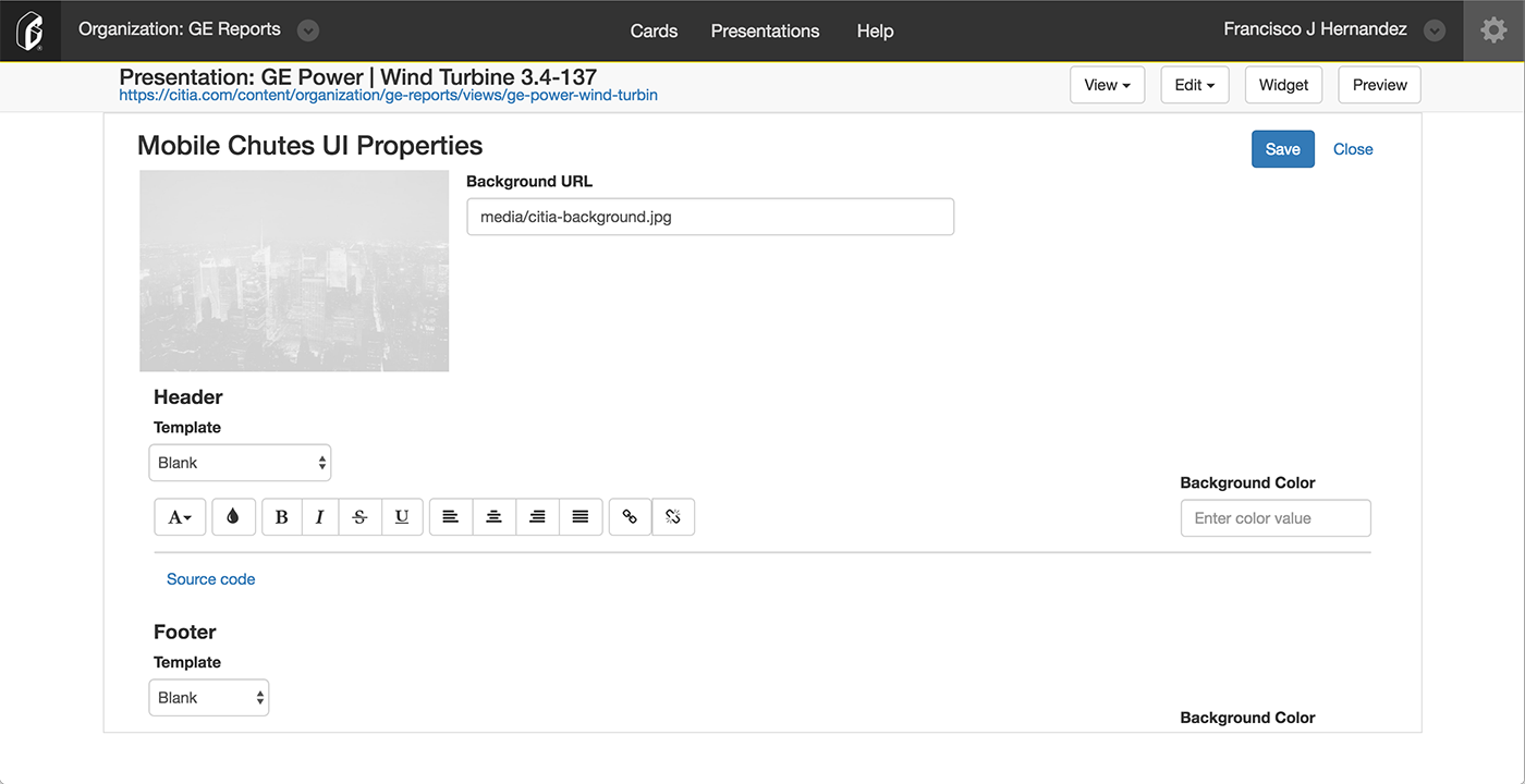
Phase two would be to implement the style guide to the main tool, and phase three would be
to implement the style guide to the interior pages (Properties, Header and Footer, Thumbnails etc.).
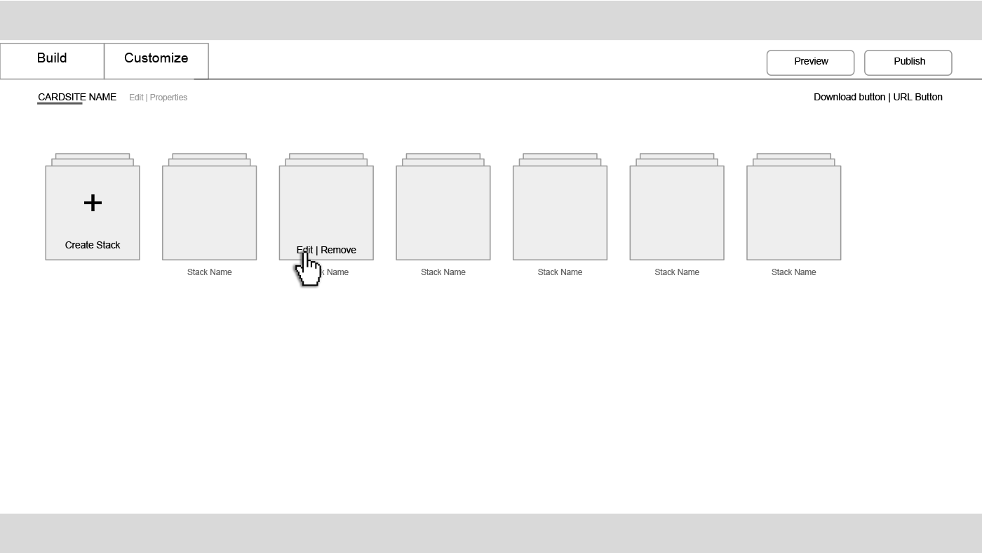
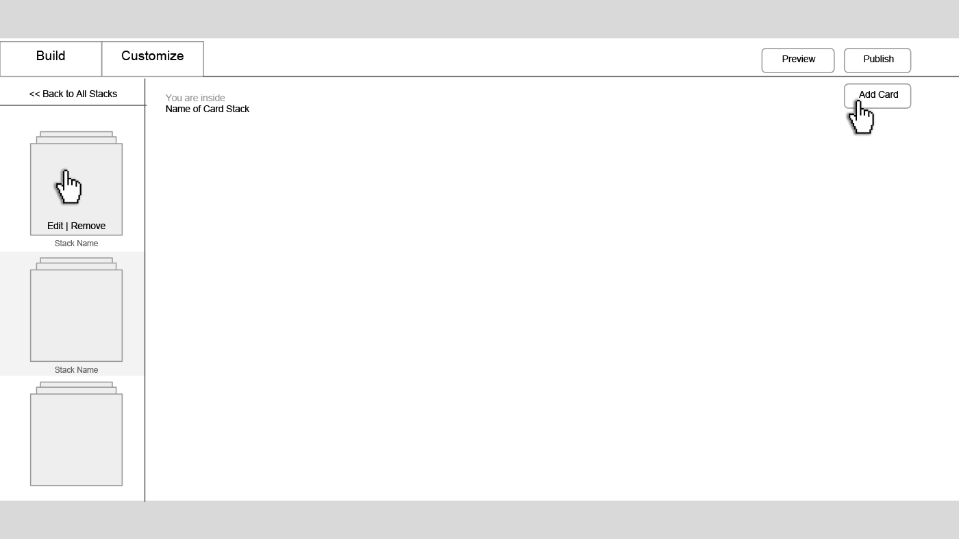
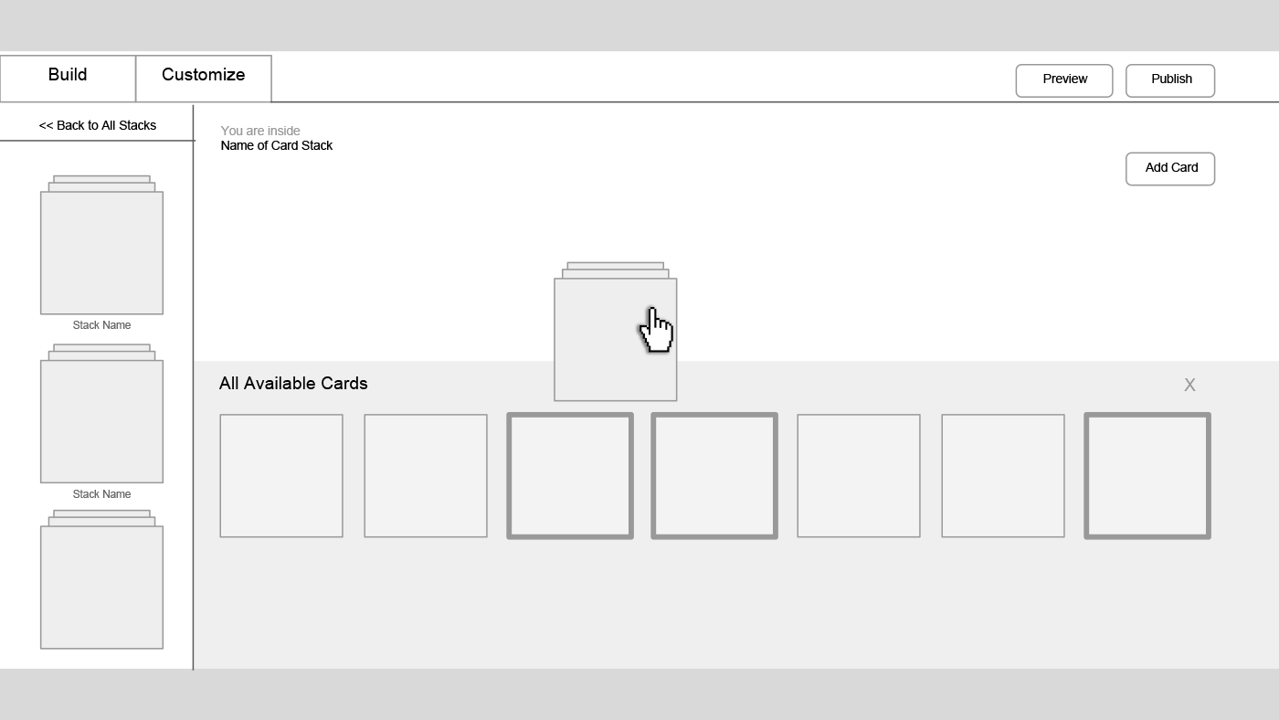
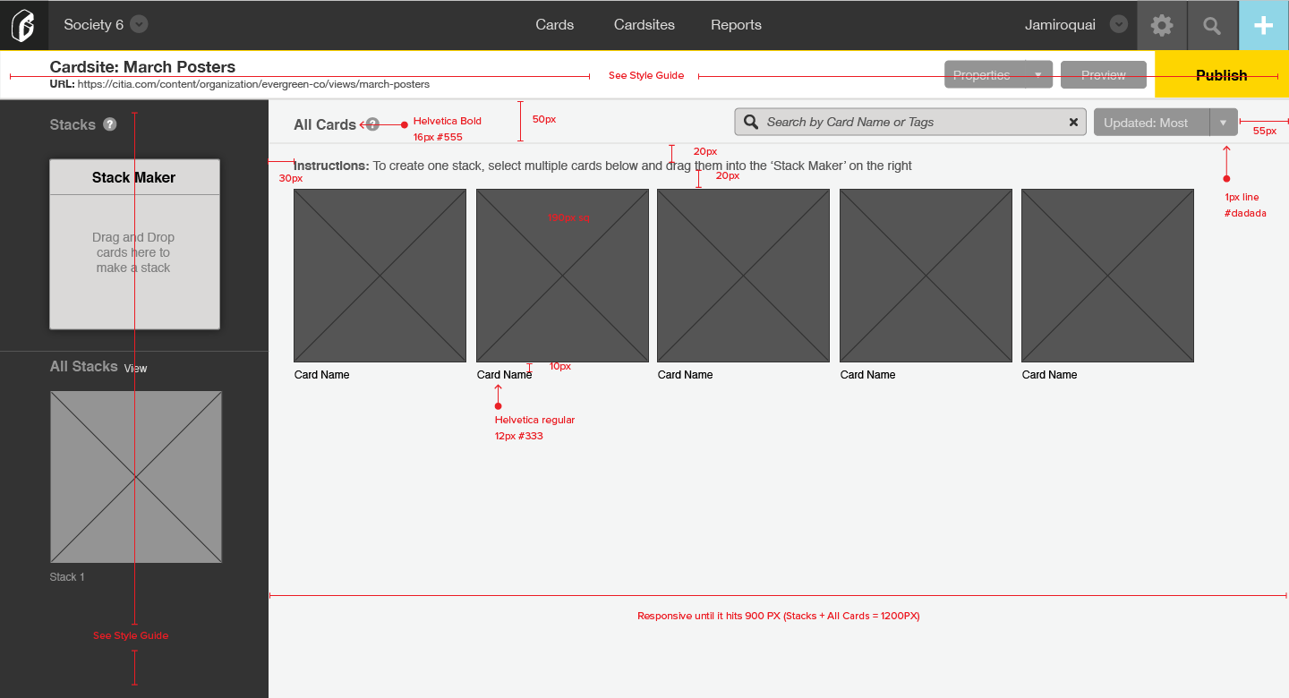
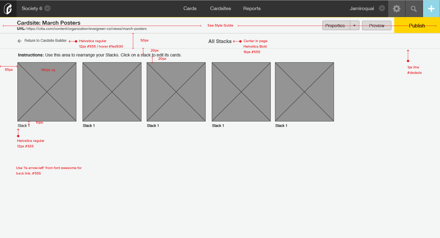
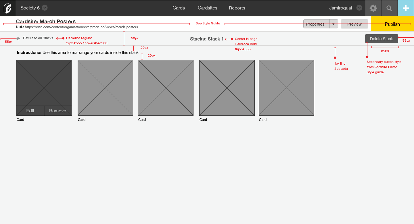
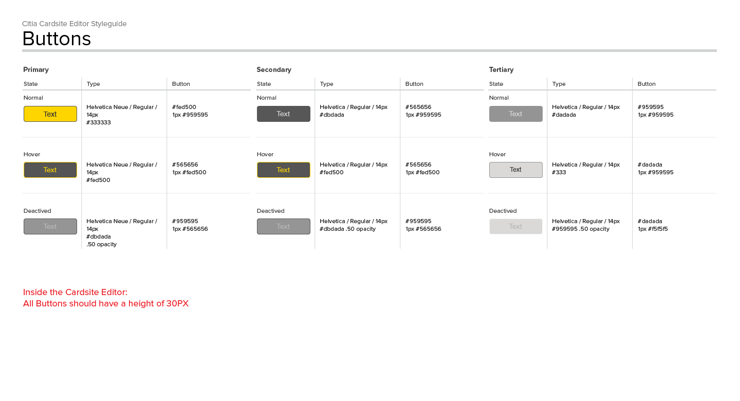
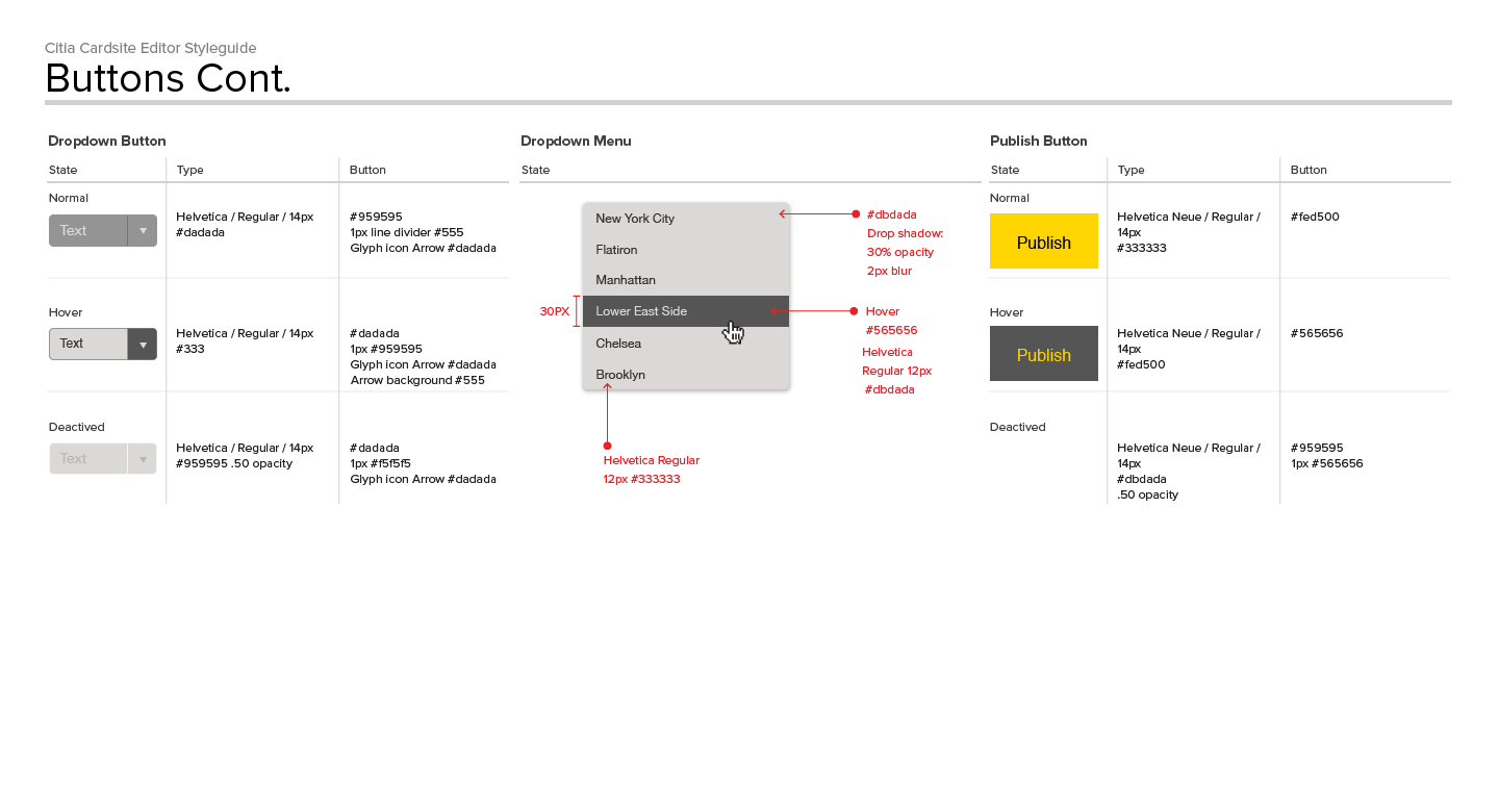
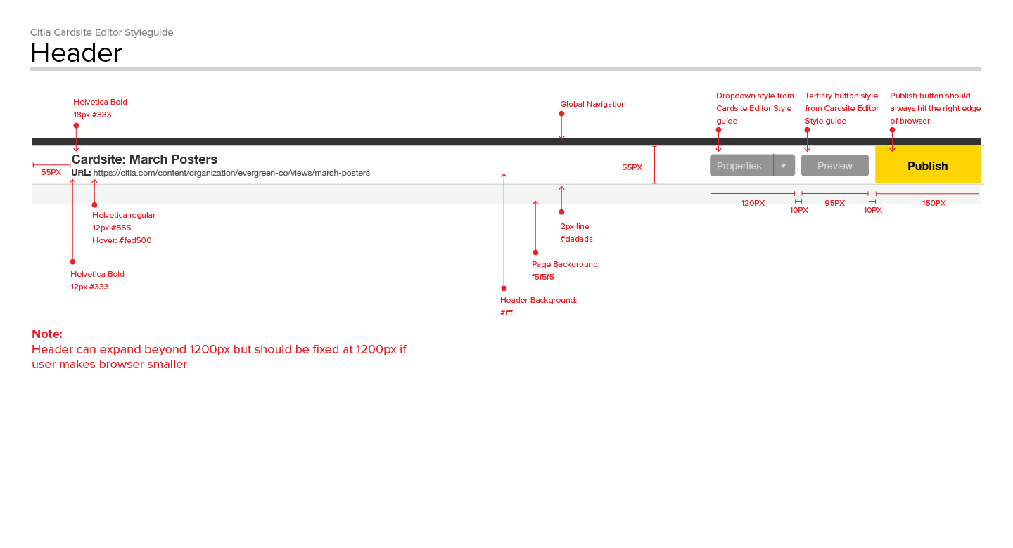
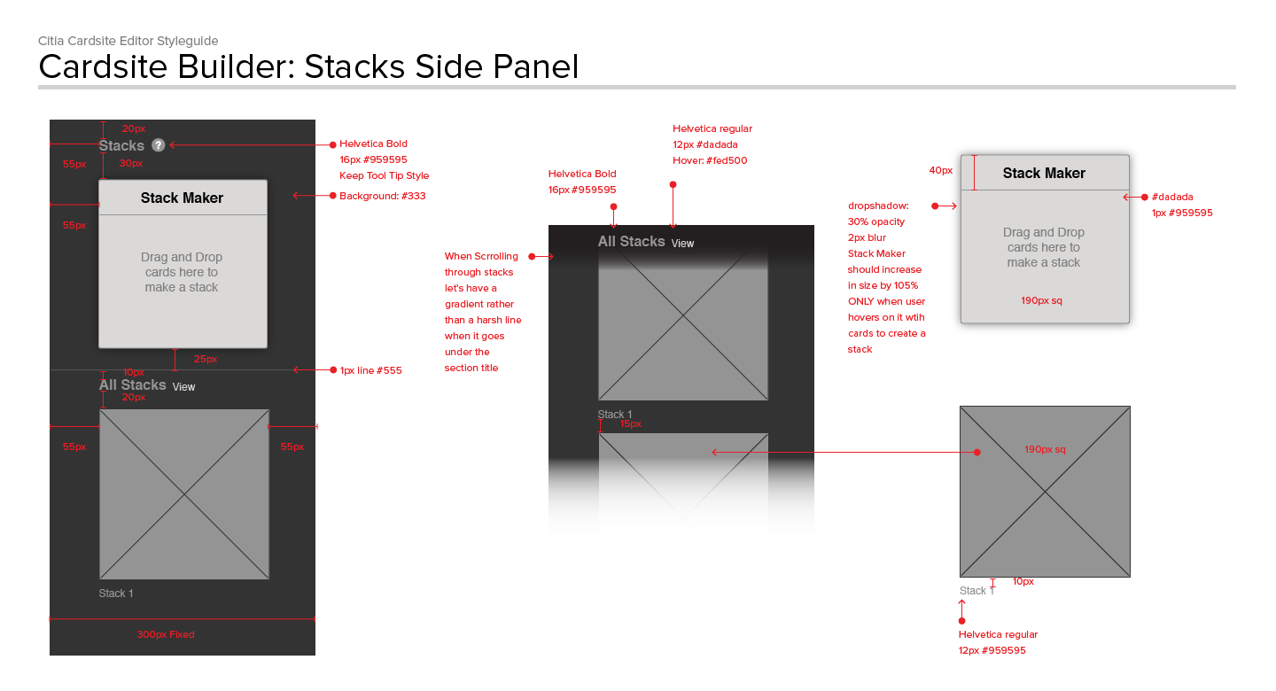
Wireframes
The wireframes for this project was more conceptual than a literal implementation.
I set out making these wireframes to be a future version of our builder.
I even designed a whole version of our builder that was never put into production.
Final Words
With every project I've listed on my website there is a sense of completion,
even though we are constantly improving and changing the product.
With this project I still feel it incomplete. One reason, is that I feel we need to watch
users build in our system and due to time constraints for this phase we are only able to do
minor user test. The other reason is that I myself feel overwhelmed by the scope and the
complexity of our Cardsite Builder. My biggest ask to myself is: How do I de-evolve this tool
and make it more simple? Overall, the team was very pleased with the results and users
definitely made it a point to tell our client support team they found the improvements helpful.