CITIA
Card Editor
Having created a style guide I made it my responsibility to apply it to
our system starting with the Card Editor, our most frequently used tool. .
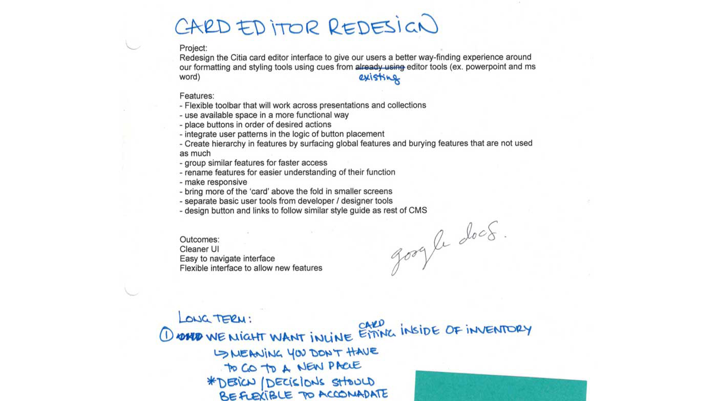
Problem
Our Card Editor had an outdated look and feel and disjointed tools inside the
building experience. Users had a hard time finding tools in our card editor
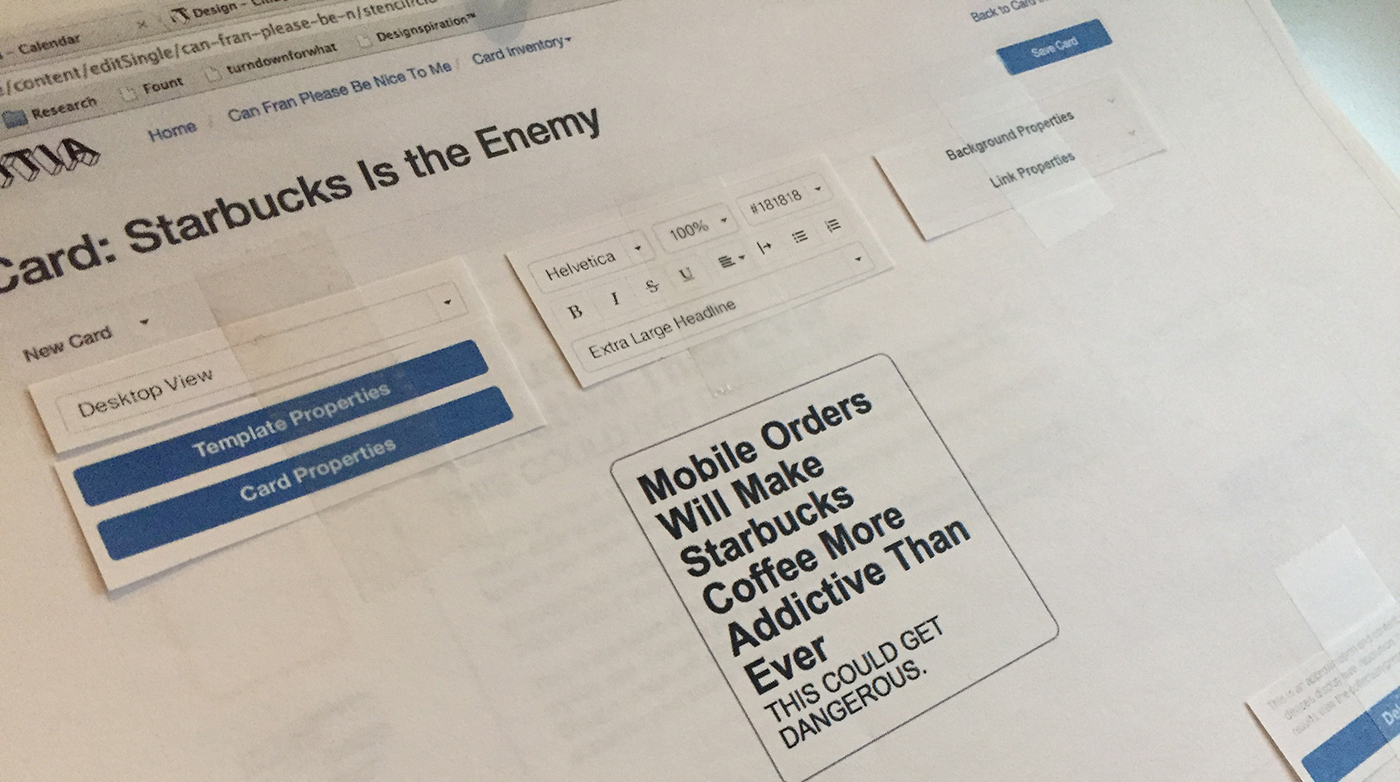
this lead to frustration using our software. We made paper mock-ups and had users
move tools around that showed how they would envision our tool. My research included
inspecting various WYSIWYGs and Editors. The range included products email blast
editors like mailchimp and Campaign Monitor to direct competitors such as Trello,
Mailchimp and Wix.
We proposed redesigning the card editor to group editing tools and features for more efficient work flow as well
as providing more of the card layout above the browser fold. The end goals for
this project was a more considerate user experience, an easy to navigate interface,
a flexible interface to allow future features and implementing consistent styles
that matched our new style guide.
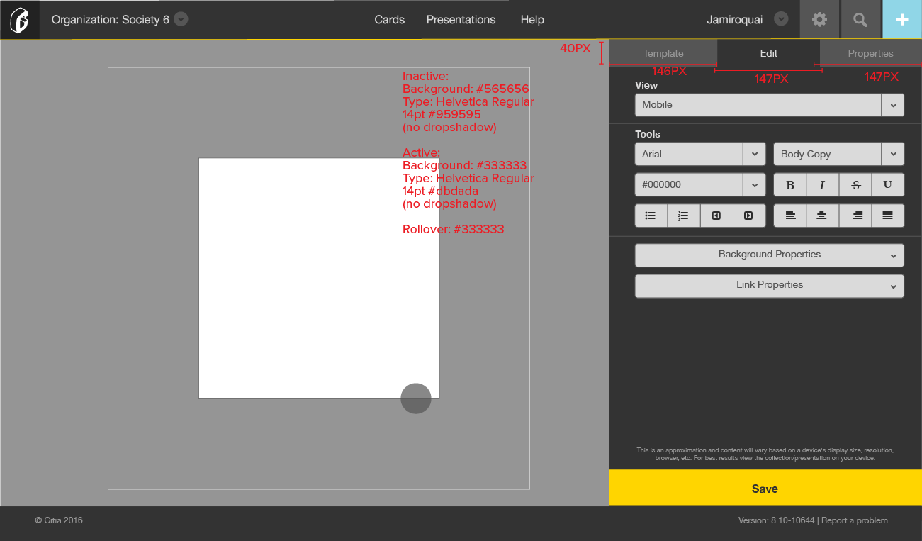
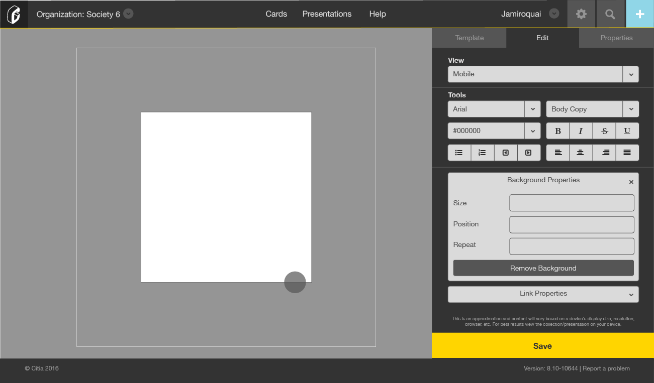
Outcome
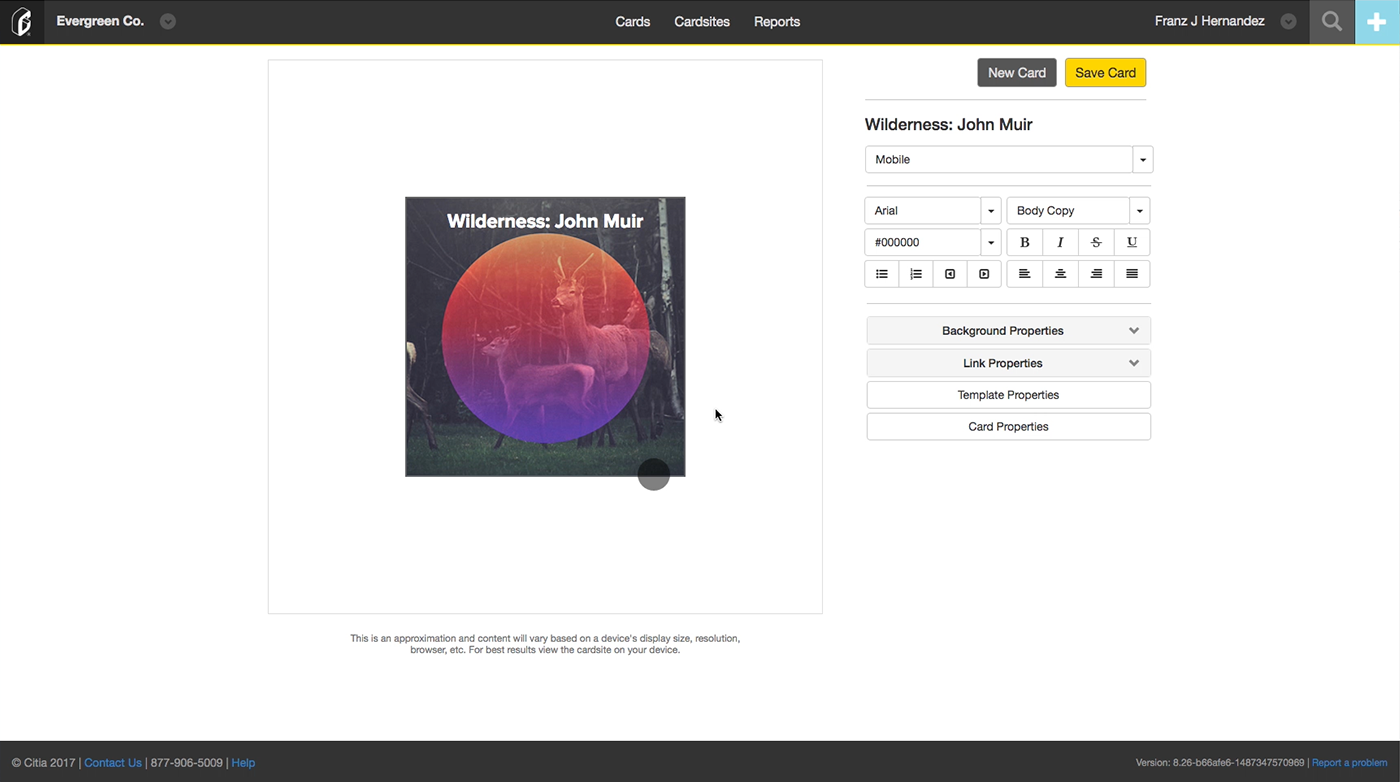
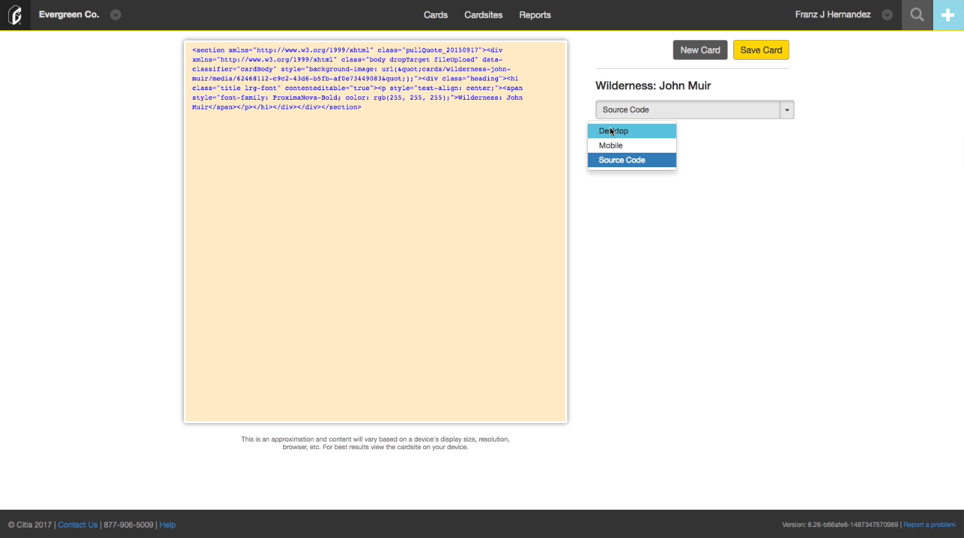
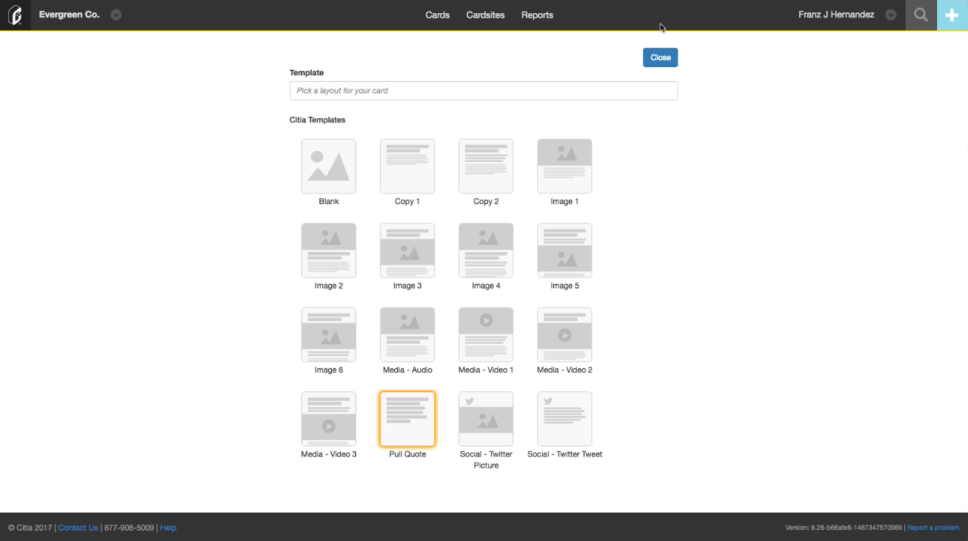
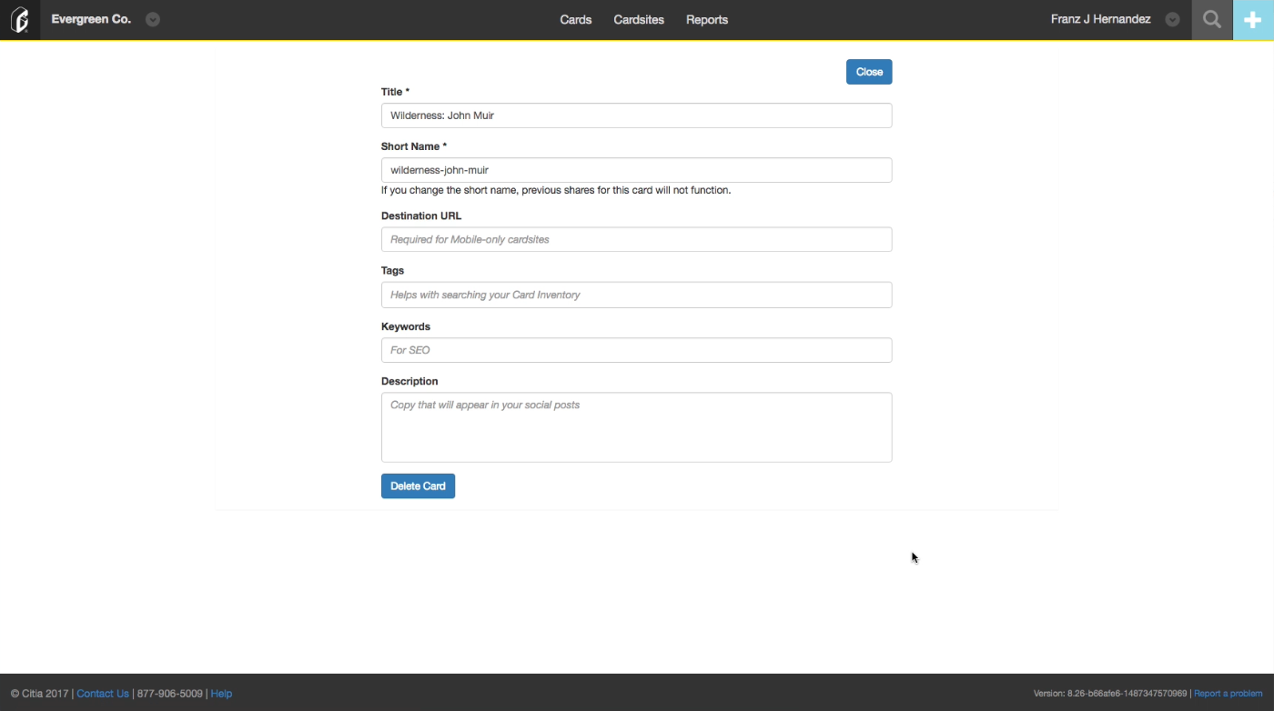
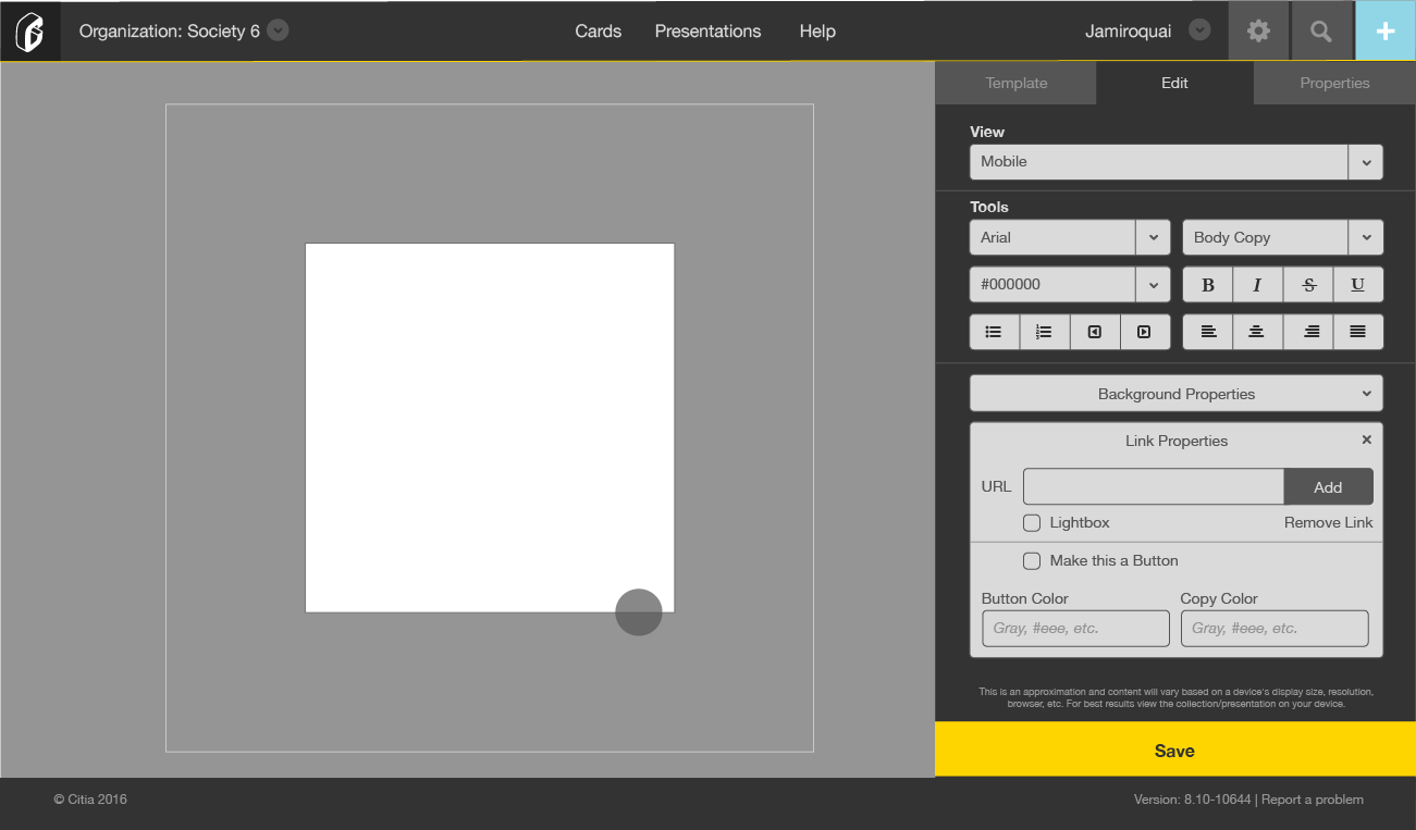
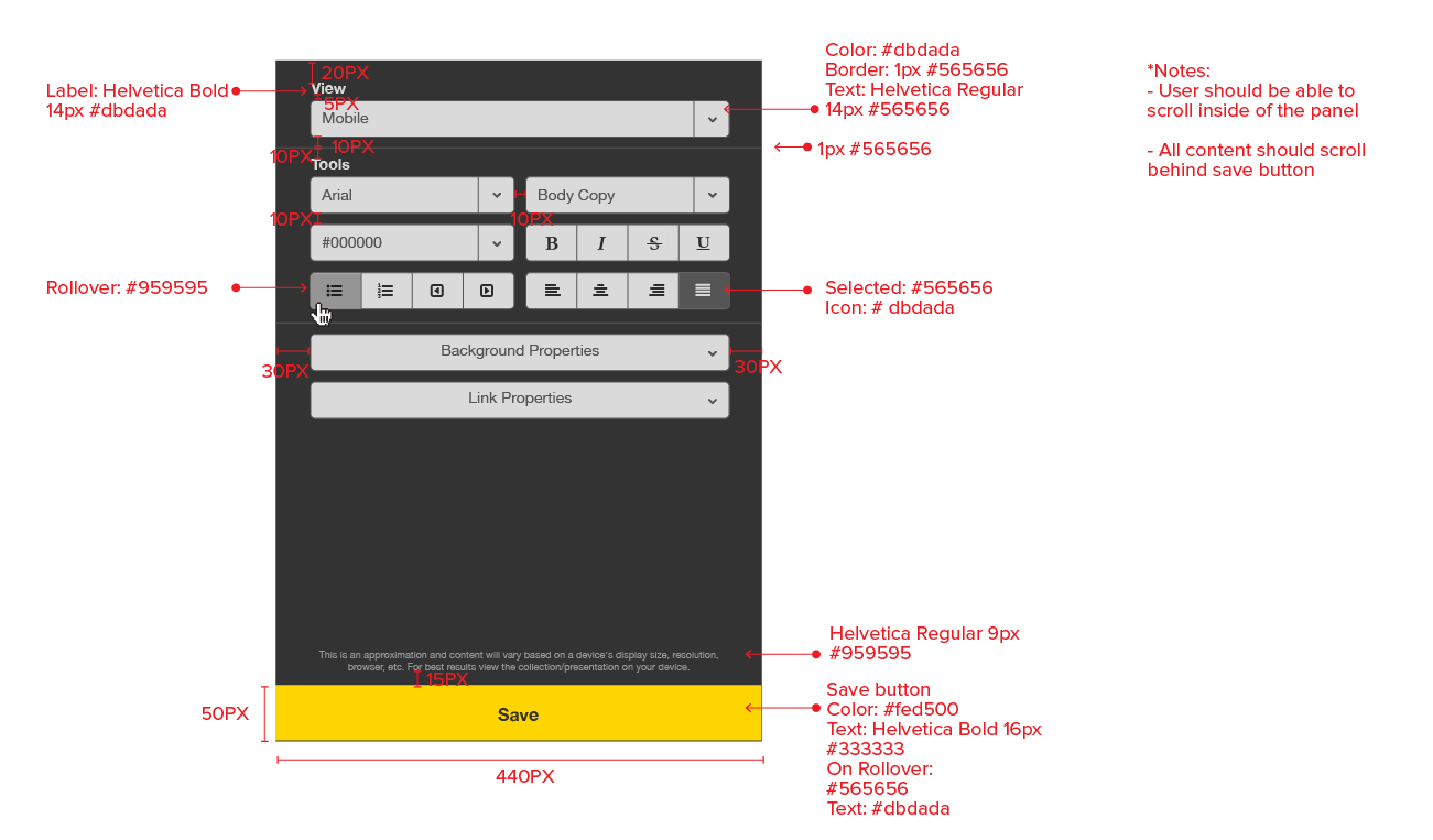
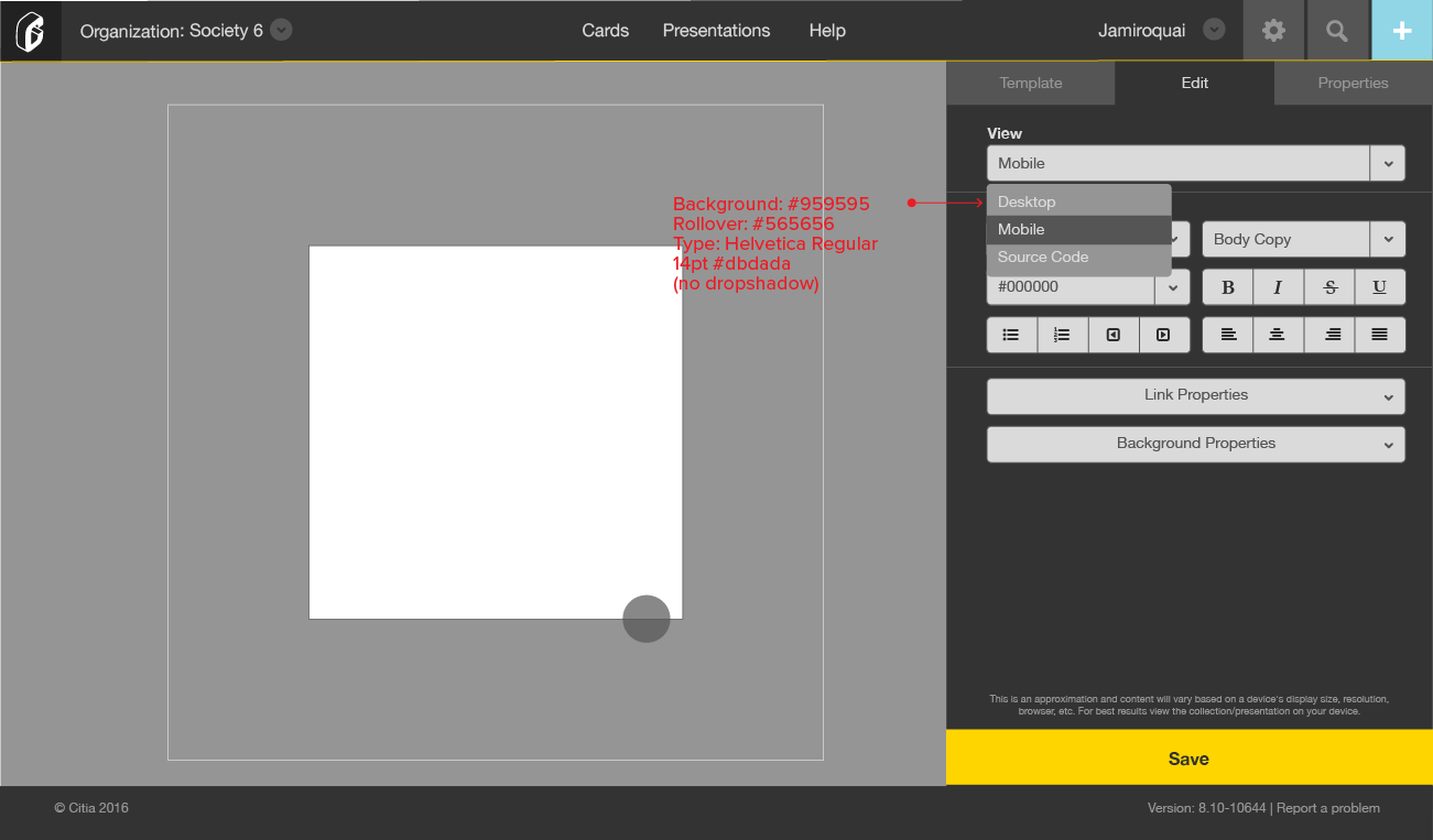
My main goal for the redesign was to keep the card always in full display to create
a connection between templates and properties of the card. I decided to have all the
tools on a tabbed side panel on the right side of the page. By collecting and nesting
features I created a more intuitive user experience while elevating the design of the layout.
Above are the final screens delivered to the development team for production.